Photo credit Atle Mo
Saint Paul Winter Carnival
Modernized website design, logo, and branding for Minnesota’s annual Saint Paul Winter Carnival.
Use a recognizable image to allude to the company name,
product, service, or brand attribute. These images may be literal,
conceptual, or metaphorical. Design a minimum of two identity marks, one for each. Include new branding and a redesigned website.

Current Saint Paul Winter Carnival Logo
Before knowing what the event is, the logo doesn’t give much idea of what the event is about. It can be understood that the snowflake is about it being in Winter, and the rainbow colors could be tied to the carnival aspect of it, which reminds the viewer of clowns. Something that shouldn’t be linked to this type of carnival. The logo is perhaps a bit busy with the dots inside the snowflake. This logo could simplify compared to the popular minimalistic approach to other famous logos. Uses of rainbow colors are also inevitably tied to LGBTQ+ and feel disruptive to the event's focal point. The shape of the snowflake also reminds me of paper snowflakes kids would make in elementary.
New Logo Creation Process


Current Saint Paul Winter Carnival Website
The current website is visually unappealing, lacking information, and lacking. The homepage is dull and is unable to excite viewers. The About page is just one extensive inset section of text that discourages viewers from reading it. The events page is unorganized, difficult to use, and lacks a clear schedule of events.
Saint Paul HomepageSaint Paul aboutSaint Paul eventsWebsite Design
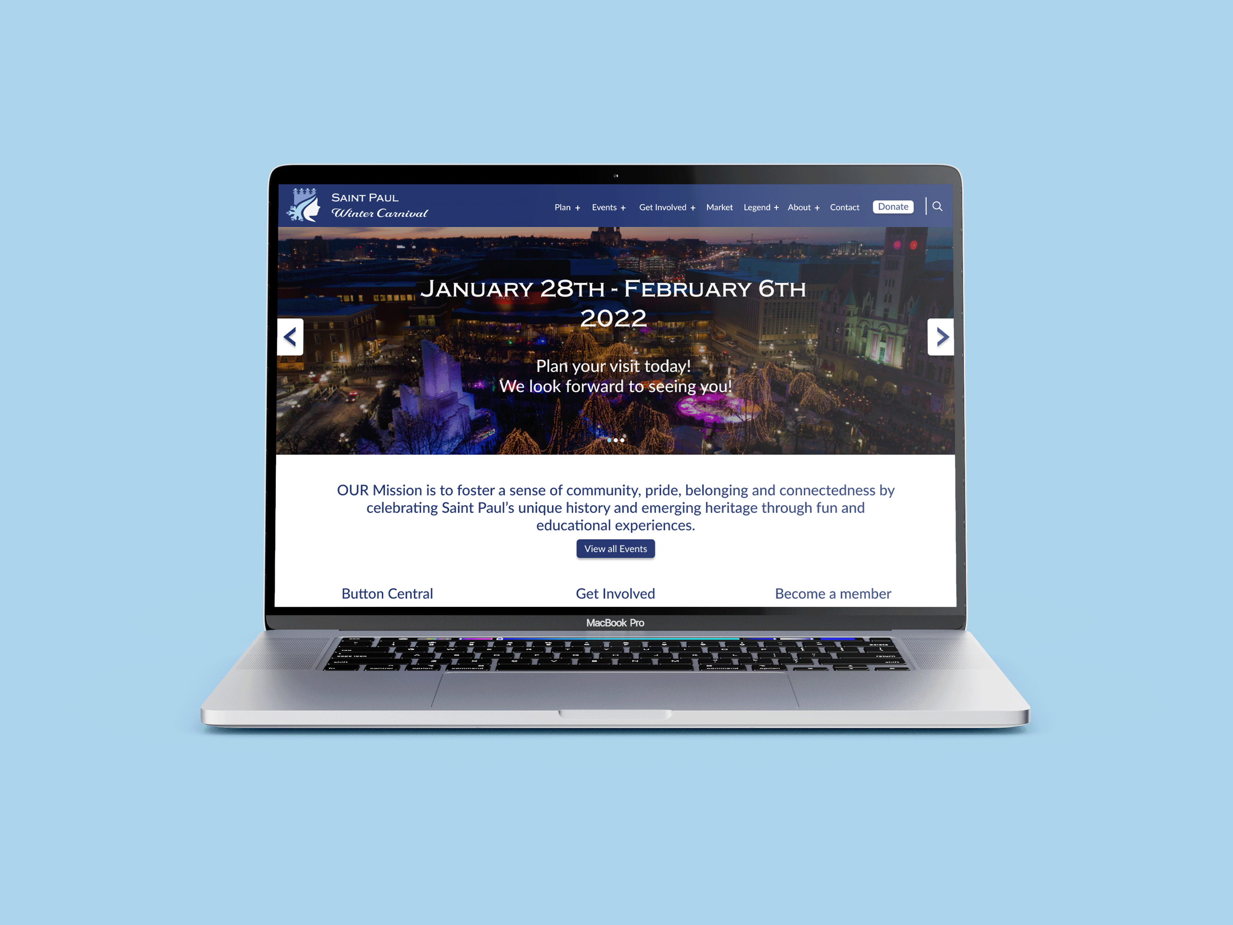
For the website redesign, I created a new header that now has all information on one line. Most of the tabs remained the same. Donate button is now highlighted. Replaced the photo section with a slideshow where the hosts can feature a few headlines on their pages. I kept the three-button style in respect of the button tradition they were trying to display with the original website. The events page now has a clear calender of upcoming events along with a subscription box. The about page features a more visually pleasing layout of information that encourages users to read.


Branding


Full Logo Variations
Simple Horizontal - Light / Dark
Detail Horizontal - Light / Dark


Visual Branding
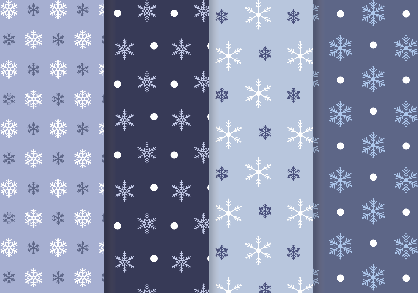
For the color palette, I took inspiration from the ice sculptures with the lights in them and from Winter itself. The patterns are just variations of snowflakes. While that is nothing new to events in the Winter, snowflakes will always feel festive for the cold portions of the year. Logo Icon was also made to fit mobile qualifications.
Promotional Posters


