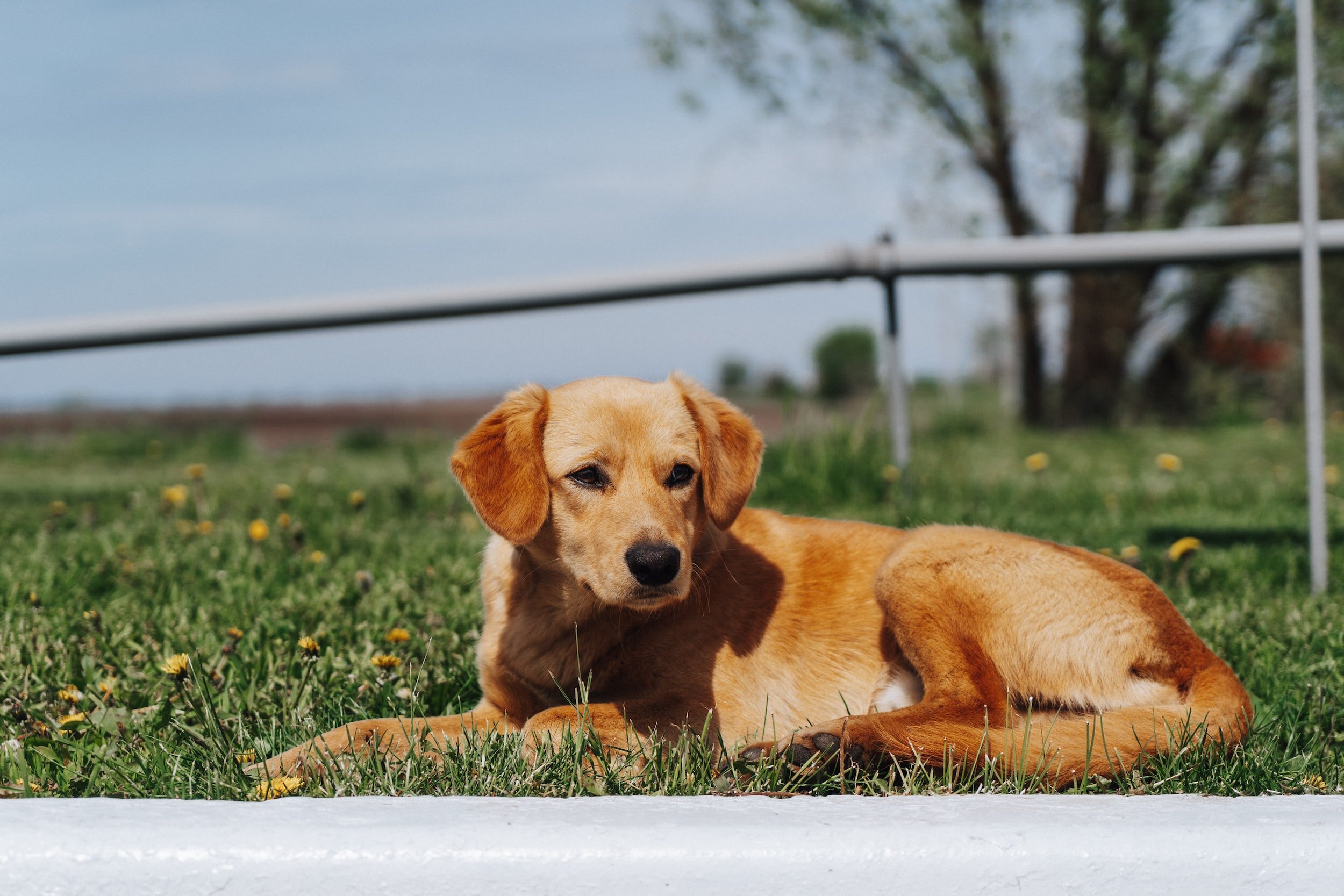
Photo credit Eric Jamesward
Hope for Paws
Website and logo design for non-profit organization Hope for Paws.
This projects focus is on redesigning a website for a non-profit organization or cultural institution. The objective of this project is to update the visual design and overall usability of the website for a target audience. It is important to provide clear and concise information about the organization and its purpose while also highlighting ways in which visitors can engage with its services, events, or products.

Photo credit Vitalii Khodzinskyi
The Client
Hope for Paws is a non-profit animal rescue organization that works tirelessly to rescue animals in need and provide them with the care they require. Founded in 2008 by Eldad Hagar and his wife Audrey, Hope for Paws has become a leading voice in the animal welfare community. The organization is dedicated to rescuing animals from dangerous or abusive situations, providing them with medical care, and finding them loving forever homes. In addition to its rescue efforts, Hope for Paws also works to raise awareness about animal welfare issues and advocates for stronger laws to protect animals from cruelty and neglect. Thanks to the dedication of its staff and volunteers, Hope for Paws has saved countless lives and brought hope to animals in need across the country.
The Problem
The Hope for Paws website, while serving as an important platform for animal rescue and advocacy efforts, lacks an appealing design that may hinder its effectiveness. The website's user interface is cluttered with a plethora of text and images, making it difficult to navigate and locate specific information. Additionally, the color scheme and typography do not appear to be optimized for web viewing, which can make the reading experience less enjoyable. A redesign of the Hope for Paws website should focus on creating a more modern, visually appealing design that is intuitive and easy to use. By doing so, the organization can better engage with its audience and raise awareness for its cause.
Original Website


Analysis
Needs
An inviting layout
Less visual aggression
Trustworthy logo
Easy to see their own impact
Easy adoptions
Ability to support the organization
Upfront information
Challenges
In your face, aggressive content that fills much of the screen
Homepage is depressing due to their focus
Lacking in information
Lacking inviting links to their other pages
Untrustworthy appearance
Goals
Client Goals
Feel professional and trustworthy
Encourage visitors to support by donating
Have more successful adoptions
User Goals
Easily navigate through website
See a trustworthy impact from organization and users side
Donate, adopt, support
Brand Goals
Help animals in need
Rehabilitate animals and help find them loving homes
Spread awareness on animal cruelty
Usability Testing Original Website
The results of the usability testing conducted on the Hope for Paws website indicated that a majority of users found the site to be overwhelming due to its excessive use of vibrant colors and styles. Users reported that the website appeared chaotic, making it difficult for them to navigate through. Although users were able to locate information on the website, they expressed reluctance in doing so as they found the website visually uncomfortable, causing discomfort to their eyes. These findings suggest that there is a need for improvement in the website's design and layout. Implementing changes that address these issues can lead to an improved user experience, resulting in increased engagement and interaction with the site.
Wireframes


Usability Testing Refined Concepts
The user testing phase of a product development process can be a critical step in ensuring that the final product meets the needs and expectations of the target audience. While the recent user testing was largely successful, there were a few details that require further refinement for the finished product. Specifically, some users noted that the homepage had two donate buttons positioned too closely together, which could cause confusion or frustration. Additionally, the social media icons still featured a white border, which may detract from the overall aesthetic appeal of the page. Finally, some users felt that the "About Us" section had too much content placed too closely together towards the bottom, with insufficient negative space to break up large chunks of information. Addressing these issues should help to improve the overall user experience and ensure that the final product is well-received by its intended audience.
Original Logo
The original logo is childish, complicated, and unappealing. Hope for Paws needs a simple logo that can be put on their gear or merch. They need a more mature logo that feels more trustworthy to a new customer. The new logo should encapsulate their mission, to save animals in need, with their brand name while remaining basic.
Logo Sketches, Refinement, Final


Final Design
The final website redesign is a near-complete overhaul of what Hope for Paws originally had. The many bright colors are gone and replaced by a mature white and light grey with hints of green and blue. The new logo pops and generally feels more trustworthy than the previous one. Homepage no longer has the same depressing tone and now has content in a more positive light. White space was heavily embraced to steer far away from their cluttered, overwhelming layout before. Adoption has a new filter system along with brief descriptions.


